Paint Colors to Avoid When Listing Your Home (and what to do instead)
If you’re about to list your home and you’re thinking, “Should I repaint first?” — the answer is usually: maybe, but not the whole place, and definitely not based on your personal favorite color.
Paint is one of the first things buyers notice… and one of the first things that makes them mentally start adding up “projects.” The goal isn’t to make your house look like a boring box. The goal is to make it easy for a buyer to picture their life there without thinking, “Cool… I’m repainting this entire room the first weekend.”
The biggest paint offenders (aka: what buyers tend to side-eye)
1) Bold reds + oranges
These colors can feel intense in big spaces and can make rooms feel smaller/darker — especially living rooms and bedrooms.
Where it’s most likely to hurt you: living rooms, primary bedrooms, open concept areas.
2) Deep browns + charcoal in tight spaces
Dark can look great in a Pinterest-perfect photo… and feel like a cave in a hallway with average lighting.
Where it’s most likely to hurt you: hallways, small bathrooms, narrow rooms.
3) Bright / neon colors
Lime green, hot pink, electric blue… fun for personal style, but most buyers read it as: “I’m painting over this immediately.”
Where it’s most likely to hurt you: bedrooms, bathrooms, playrooms.
4) Moody black everywhere
A black accent? Sometimes gorgeous. A full black room or ceiling? Risky — it absorbs light and shows imperfections like it’s getting paid to do it.
Where it’s most likely to hurt you: living spaces, bedrooms, open concept zones.
5) “Personalized” colors (the ones that scream your taste)
Think eggplant, turquoise, mustard… even if a buyer doesn’t hate it, it can distract from the home and make them mentally budget repainting.
Where it’s most likely to hurt you: honestly… everywhere.
6) Stark bright white
White can be a win, but super bright “hospital white” can look cold and can highlight dirt/scuffs fast (especially in high-traffic areas).
So… what should you use instead?
Here’s the simple strategy:
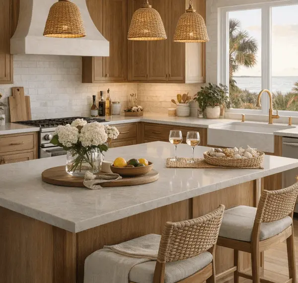
Keep the main living areas consistent (same neutral through living room/hallways/kitchen when possible), and choose calmer tones for bedrooms/baths.
Main areas (living room / halls / kitchen):
-
soft greige
-
warm beige
-
light taupe
Bedrooms:
-
soft blues
-
muted greens
-
light grays
Bathrooms:
-
pale blue
-
light sage
-
soft white
Warm white ideas (if you want “clean” without “clinical”):
-
Sherwin-Williams Alabaster
-
Benjamin Moore White Dove
-
Valspar Swiss Coffee
My Gulf Coast reality check (so you don’t repaint for no reason)
Before you spend a weekend and a small fortune on paint, do this:
-
Walk your house like a buyer (or FaceTime a friend and make them be brutally honest).
-
If a color is loud, dark, or super-specific, ask: “Is this the first thing you notice?”
-
If yes, repaint that room first. You probably don’t need to repaint everything.
If you want, I’ll tell you exactly which rooms are worth repainting for your specific house — and which ones are fine as-is.
—
Katie Ragland | 256-366-6974 | Real Broker, LLC
https://linktr.ee/katieraglandrealtor
Want a faster way to get these updates? Follow out my podcast here: Keys & Clarity with Katie Ragland
https://open.spotify.com/show/5CPSTHAuT0WpttgU0kUt7T?si=Ivnrn1TIT6iFxE6EzP4gWg
Categories
Recent Posts